Subsequent to the referencing of a Nature paper as evidence of something or other about the actual spectral sensitivities of human retinal cones, the "discussion" made a small side-trip into my standard whinge about the wall of pay-for-play scientific journalism. I did finally extort the referenced paper, and a few others, from someone-with-access and found that none of them answered any of the questions very well. As usual. But worse they don't seem to agree amongst themselves.
The problem is that spectral-violet -- which I am going to somewhat arbitrarily define as a "color" with a wavelength below 400nm -- falls outside of the gamut of all common color reproduction methods so it cannot be viewed on a screen or in print. To exacerbate the issue, the non-spectral purples and magentas are often confused with violet, even in nomenclature, such that folks often say, "Sure, violet is blue with a bit of red in it."
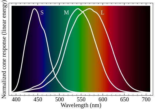
To start with I went off looking for a good plot of the spectral response of the cones of the human retina. The obvious one was from the wiki Color Vision page:
(note: I replaced the missing wiki image 7/28/13...)
But it has a linear vertical scale AND the levels are normalized such that one cannot judge relative sensitivity. It also uses the scientifically accurate but completely confusing labeling: S,M,L for Short, Medium, and Long wavelength rather than just coming out and saying Blue, Green, and Red like anyone talking about it would. It does show the more-or-less center points of the sensitivities to be around:
- blue(S) 440 nm
- green(M) 540 nm
- red(L) 570 nm

Unfortunately most of these are also normalized, and also seem to have had some CIE post-processing applied -- if one can make sense out of the accompanying information. But at the bottom of the list there are a couple that look like they aren't normalized, e.g., the Smith & Pokorny (1975) (also subject to post-processing per the notes, but may be good enough for me):

Modulo the journal accessibility problem, I did make a number of passes at finding actual papers that might be the source for this data. I found two by Stockman, etal (one for the M&L cones (1993) and another for the S cones (1999) but I'm not sure how to match-up the vertical scales). And an earlier one by Wald (1964) that has all three in one plot but has the sensitivities and curve shapes jumbled up compared to every other example (get back to me if you make sense of any of it, ok?):

Then I moved on to color reproduction starting at the wiki CIE 1931 color space page which (attempts to) explain those lovely "color tongue" diagrams on which one can plot various primary sets to indicate the relative gamuts. This one shows the "CIE RGB primaries" forming the lower triangle which are at:
- blue 435.8 nm
- green 546.1 nm
- red 700 nm

For comparison, here's wiki's sRGB space which is around-and-about what one can display on a computer screen:

Note that the colors on all these images are fake, since anything outside of the marked triangles cannot be imitated by mixing the apex colors. Also notice that spectral-violet falls off the bottom of the tongue at the lower left corner, and can only be reproduced using an emitter of less than 400nm light. Which no one has.
The next thing that occurred to me is: "How do we distinguish all those blue-greens at the top of the tongue if our green sensor is so far down the curve?"
I think the answer to that is in looking at the relative responses of each cone when exposed to the spectral stimulus, compared to an attempted "synthesizing" stimulus. In this diagram I have marked 520nm (from the tip of the tongue) as the target and indicated the peak sensitivities of each cone in the relevant color:

By comparing the ratios of "activations" between the 520 line and the combination of 440 and 540 lines, I think we can see that the RED signal ratio may be much higher for a synthesized color. This will tend to de-saturate the reproduced color as compared to its spectral "equivalent", so reproduced colors will be "pulled" in to the center of the triangle. But through the offices of the gradual fall off in response of the red and green cones, spectral colors will invoke a uniquely distinguishable response.
Given the above, it then appears that spectral-violet is formed by an identical, low, response from each cone, as compared to the actual blue stimulus further to the right in the spectrum.
So that's my story to which I stick until I find someone who can explain it to me.
No comments:
Post a Comment