Wednesday, August 3, 2011

Lazy Reposting....


Just to keep this one-sided conversation in play, found these two gems at Dangerous Minds:

Because most folks confuse me with Eeyore.

And Star Trek went where I'd never been before.
[8/7/11 -- darnit, had to re-find/post the images because something went wrong somewhere....]

Saturday, July 30, 2011

Seeing Violet

Last month I got into a pointlessly circular -- what other kind are there I guess, eh? -- online "discussion" about how one sees the spectral color violet: Since it is out there beyond blue, what sort of sensory signals are we interpreting in order to believe that we see a distinctive color? The "discussion" became so circular that I began to think that I had actually never seen real violet, and sans spectrometer or even a diffraction grating it may be that I will never know.

Subsequent to the referencing of a Nature paper as evidence of something or other about the actual spectral sensitivities of human retinal cones, the "discussion" made a small side-trip into my standard whinge about the wall of pay-for-play scientific journalism. I did finally extort the referenced paper, and a few others, from someone-with-access and found that none of them answered any of the questions very well. As usual. But worse they don't seem to agree amongst themselves.

The problem is that spectral-violet -- which I am going to somewhat arbitrarily define as a "color" with a wavelength below 400nm -- falls outside of the gamut of all common color reproduction methods so it cannot be viewed on a screen or in print. To exacerbate the issue, the non-spectral purples and magentas are often confused with violet, even in nomenclature, such that folks often say, "Sure, violet is blue with a bit of red in it."

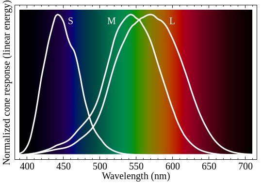
To start with I went off looking for a good plot of the spectral response of the cones of the human retina. The obvious one was from the wiki Color Vision page:
 (note: I replaced the missing wiki image 7/28/13...)

But it has a linear vertical scale AND the levels are normalized such that one cannot judge relative sensitivity. It also uses the scientifically accurate but completely confusing labeling: S,M,L for Short, Medium, and Long wavelength rather than just coming out and saying Blue, Green, and Red like anyone talking about it would. It does show the more-or-less center points of the sensitivities to be around:
  • blue(S) 440 nm
  • green(M) 540 nm
  • red(L) 570 nm
Since what I'm interested in is the response right at the origin of that graph I need more detail in the tails. So I found some -- actually a lot of -- log plots at the Color and Vision Research Laboratory at University College London:


Unfortunately most of these are also normalized, and also seem to have had some CIE post-processing applied -- if one can make sense out of the accompanying information. But at the bottom of the list there are a couple that look like they aren't normalized, e.g., the Smith & Pokorny (1975) (also subject to post-processing per the notes, but may be good enough for me):

Modulo the journal accessibility problem, I did make a number of passes at finding actual papers that might be the source for this data. I found two by Stockman, etal (one for the M&L cones (1993) and another for the S cones (1999) but I'm not sure how to match-up the vertical scales). And an earlier one by Wald (1964)  that has all three in one plot but has the sensitivities and curve shapes jumbled up compared to every other example (get back to me if you make sense of any of it, ok?):


Then I moved on to color reproduction starting at the wiki CIE 1931 color space page which (attempts to) explain those lovely "color tongue" diagrams on which one can plot various primary sets to indicate the relative gamuts. This one shows the "CIE RGB primaries" forming the lower triangle which are at:
  • blue 435.8 nm
  • green 546.1 nm
  • red 700 nm 
I have also taken the liberty of marking the position of the SML cone center sensitivities on this in white for reference. Interesting to note that the nominal red sensor is actually more like yellow in our scheme of things:

For comparison, here's wiki's sRGB space which is around-and-about what one can display on a computer screen:

Note that the colors on all these images are fake, since anything outside of the marked triangles cannot be imitated by mixing the apex colors.  Also notice that spectral-violet falls off the bottom of the tongue at the lower left corner, and can only be reproduced using an emitter of less than 400nm light. Which no one has.

The next thing that occurred to me is: "How do we distinguish all those blue-greens at the top of the tongue if our green sensor is so far down the curve?"

I think the answer to that is in looking at the relative responses of each cone when exposed to the spectral stimulus, compared to an attempted "synthesizing" stimulus. In this diagram I have marked 520nm (from the tip of the tongue) as the target and indicated the peak sensitivities of each cone in the relevant color:


By comparing the ratios of "activations" between the 520 line and the combination of 440 and 540 lines, I think we can see that the RED signal ratio may be much higher for a synthesized color. This will tend to de-saturate the reproduced color as compared to its spectral "equivalent", so reproduced colors will be "pulled" in to the center of the triangle.  But through the offices of the gradual fall off in response of the red and green cones, spectral colors will invoke a uniquely distinguishable response.

Given the above, it then appears that spectral-violet is formed by an identical, low, response from each cone, as compared to the actual blue stimulus further to the right in the spectrum.

So that's my story to which I stick until I find someone who can explain it to me.

Wednesday, July 27, 2011

Talk to the -- Moving -- Hand

More progress. All the bits move. Amazing, no?

Still need to make a stand and mount the arm motor so it can swing up and down...And of course the control electronics...I'm also going to need a full-on arc welder power supply to run the finger solenoids, but can reuse it in other projects after I find a place to store this one.

Saturday, July 23, 2011

A Modest Proposal, II

Now that chatroulette seems to have run it's course I think it's time to update the paradigm a bit. I propose cliqueRoulette at, of course, cliqueroulette.com...

It would do much the same thing, pseudo-randomly connecting folks to one-another while allowing them to accept or reject the connections. However the great advance would be to make it more like High School by adding user defined tags, or cliques, which one can use to filter the connections. Each user would have a score for each clique that they have accessed. The score would be based on how long you remain connected to other members of the clique. While connected one can communicate until a Goodbye is sent, thus tacitly accepting the opposite member, or hit the Reject button and move on. The time to the Goodbye would add to your score and a Reject, when sent unilaterally, would subtract. Members with higher scores would be preferentially connected to each other, but some randomness would allow interlopers to intercede and perhaps gain traction. Higher scores might also translate into less advertising, faster connections, or some other more tangible rewards.

As an example, let's say there's a "boobs" clique. By playing nice you could increase your score thus making it more likely that you will score. The idea may need to be extended to allow for sub-classes like Producers, Consumers, Lurkers, Muttonheads, and etc...But you get the idea and can probably take over the implementation from here.

Send me a link when it's working.

Thursday, July 21, 2011

Another Not Nopera!

Last night, through the offices of a couple friends with a spare ticket, I was able to take in the Santa Fe Opera's Vivaldi/Sellar's Griselda, including of course, the usual sushi-pre-tailgate extravaganza. Half of the fine seats in the mid-balcony where we were sitting were empty, possibly due to this opening night review published in our daily local news-rag:  Premiere of Vivaldi Opera Misfires.

.... OK? Back? ....

It is my personal belief -- knowing basically-jack-all about opera but something about theater -- that the reviewer either saw an off-night or is off himself. There are kernels of truth in many of his quibbles so I tend to believe the latter. But I would reverse just about every one of his opinions:

  • The singing -- although a bit variable -- was quite fine throughout. I thought the King and Queen took a while to warm up but came though in the end. Amanda Majeski's Ottone was not "shrill" but the hit of the show. To extend an olive branch, I agree -- and double down -- that Isabel Leonard's Costanza was fabulous.
  • The music was balanced and easy to listen to -- one could make a case for the entire 101 Strings catalog being simply the working out of Baroque permutations.  The guest appearance of two French horns towards the end of the first act was a pleasing counterpoint to all the strings'n'things.
  • The costumes -- perhaps a bit over-the-top, but hey dude, it's OPERA -- worked well to distinguish the characters' personalities. Griselda's native blanket brought her down to S.Fe earth from her royal loftiness and Costanza's quinceaƱera dress played well to her child-bride innocence. That dress was well used by the lighting in a number of cases -- did anyone notice that her back-lit shadow looked like a Pawn shuttling around the Kings and Queens? If anything, the Southwest references were quite honorable "Coals to Newcastle".
  • The lighting was dramatic and -- usually -- well paced and placed. There were points I would have tweaked, say a tiny bit of fill when the characters were kept in the dark of their own thoughts, a widening of a spot here and there to hold focus, or some blocking changes to backup the drama. But it worked. Sometimes fantastically.
  • The set comprised a green floor, one -- bumped up to two for the penultimate Who Wants to Marry a Millionaire scene -- movable chair, and two secret service goons who provided all the backdrop one really needed. So I found the actual Gronk backdrop -- a mashup of Dali, Miro, Grotz, Rousseau, and some miscellaneous household objects -- to be superfluous. Perhaps the director was trying to emulate Merce Cunningham Style but missed the point that the individual ostensibly un-related elements need to be intrinsically interesting in and of themselves?
  • The staging. Well, given the minimalist setting, the staging did somewhat over-rely on the flooring. Which is actually fine if you are in the balcony, but maybe those lucky souls in the orchestra seats couldn't always see the cast "rolling about" upon it?  It is also my humble opinion that Sellars tends to bludgeon the dramatic bits somewhat more heavily than necessary. E.g., the final lights-out on re-Queened Griselda still sweeping the floor just seemed out of place.

Which brings me to the N.Mex'ans central complaint: "When opera people argue about whether directors have gone too far...", Baroque opera should be their touch-stone.  It was Experimental Musical Theater. This one in particular may have been the first to employ both a composer and a librettist. Performances were melded from bits and pieces to fit the capabilities and preferences of those involved. Nothing was Set-in-Stone.

Now, of course, it Should-Never-Be-Turned. When funding for The Arts is divied up it's always the Symphony and the Opera, and maybe Shakespeare in the Park, that get the big bucks. But they are not The Arts. They are History. The Arts are a living, growing, groping, thing. Thus I feel impelled to applaud Peter Sellars and the Santa Fe Opera for busting out of the envelope.

Sunday, July 17, 2011

Las Conches Endgame?

Here's what it looked like from my place on the evening of July 15:


The plume, at the southern end of the fire in the map below, is about due west and Los Alamos is just off the right edge of the photo -- which may give some idea of scale and relative position. Also, for scale, the burned area in this map is about 230 square miles....

I think much of the smoke we've seen since Friday is from back-burns meeting up with the real fire. On Monday S.Fe county is sending one of Hondo's brush trucks with a "foreign" (not of Hondo) crew up to help with mopup.

Wednesday, July 13, 2011

Local Color I

July 13, 2011 -- The Santa Fe Police Department is investigating the following reports:

• Alma Patricia Villegas-Rodriguez, 38, 6251 Airport Road, was arrested Tuesday at Super 8 Motel, 3425 Cerrillos Road, and charged with disorderly conduct. Witnesses said Villegas-Rodriguez was angry, and was kicking and yelling at a plastic bag in the parking lot.